Style of Application
Kamis, 10 Oktober 2013
0
komentar
1. Devices and Displays
Android powers millions of phones, tablets, and other devices in a wide variety of screen sizes and form factors. By taking advantage of Android's flexible layout system, you can create apps that gracefully scale from large tablets to smaller phones.
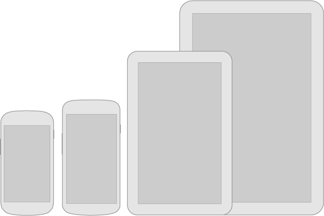
For details about designing layouts for larger screens, see the Multi-pane Layouts guide.


Be flexible
Stretch and compress your layouts to accommodate various heights and widths.Optimize layouts
On larger devices, take advantage of extra screen real estate. Create compound views that combine multiple views to reveal more content and ease navigation.Assets for all
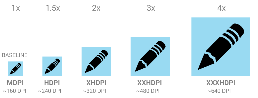
Provide resources for different screen densities (DPI) to ensure that your app looks great on any device.
Strategies
So where do you begin when designing for multiple screens? One approach is to work in the base standard (normal size and MDPI) and scale it up or down for the other buckets. Another approach is to start with the device with the largest screen size, and then scale down and figure out the UI compromises you'll need to make on smaller screens.For details about designing layouts for larger screens, see the Multi-pane Layouts guide.
2. Themes

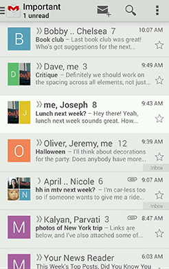
Gmail in Holo Light.

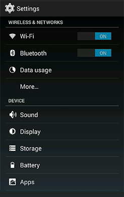
Settings in Holo Dark.

Talk in Holo Light with dark action bar.
Themes are Android's mechanism for applying a consistent style to an app or activity. The style specifies the visual properties of the elements that make up your user interface, such as color, height, padding and font size. To promote greater cohesion between all apps on the platform, Android provides three system themes that you can choose from when building apps for Ice Cream Sandwich:
Pick the system theme that best matches the needs and design aesthetics for your app. If your desire is to have a more distinct look for your app, using one of the system themes as a starting point for your customizations is a good idea. The system themes provide a solid foundation on top of which you can selectively implement your own visual stylings.
- Holo Light
- Holo Dark
- Holo Light with dark action bars
Pick the system theme that best matches the needs and design aesthetics for your app. If your desire is to have a more distinct look for your app, using one of the system themes as a starting point for your customizations is a good idea. The system themes provide a solid foundation on top of which you can selectively implement your own visual stylings.
3. Touch
Use color and illumination to respond to touches, reinforce the resulting behaviors of gestures, and indicate what actions are enabled and disabled.
Whenever a user touches an actionable area in your app, provide a visual response. This lets the user know which object was touched and that your app is "listening".
Whenever a user touches an actionable area in your app, provide a visual response. This lets the user know which object was touched and that your app is "listening".

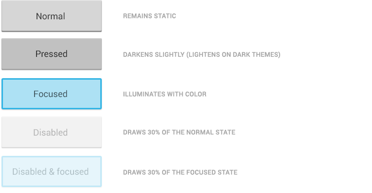
States

Most of Android's UI elements have touch-feedback built in, including states that indicate whether touching the element will have any effect.
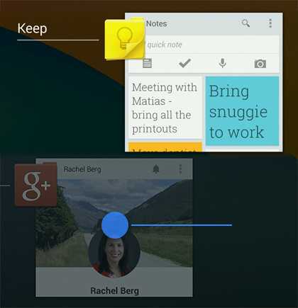
Communication
When your objects react to more complex gestures, help users understand what the outcome of the operation will be. For example, in Recents, when you start swiping a thumbnail left or right, it starts to dim. This helps the user understand that swiping will cause the item to be removed.

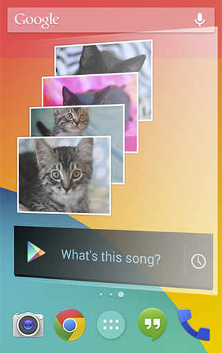
Boundaries
When users try to scroll past the upper or lower limit of a scrollable area, communicate the boundary with a visual cue. For example, if a user attempts to scroll past the first home screen panel, the screen content tilts to the right to indicate that further navigation in this direction is not possible. Many of Android's scrollable UI widgets (e.g. lists or grid lists) already have support for boundary feedback built in. If you are building custom, keep boundary feedback in mind and provide it from within your app.4. Metrics and Grids
Devices vary not only in physical size, but also in screen density (DPI). To simplify the way you design for multiple screens, think of each device as falling into a particular size bucket and density bucket:
Because it's important that you design and implement your layouts for multiple densities, the guidelines below and throught the documentation refer to layout dimensions with dp measurements instead of pixels.
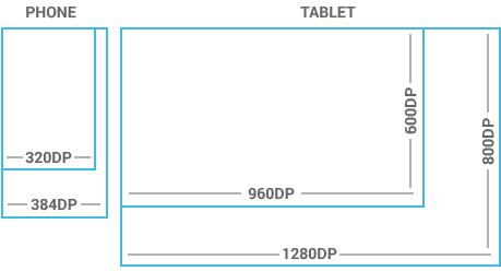
To see more, visit the Screen Sizes and Densities Device Dashboard.
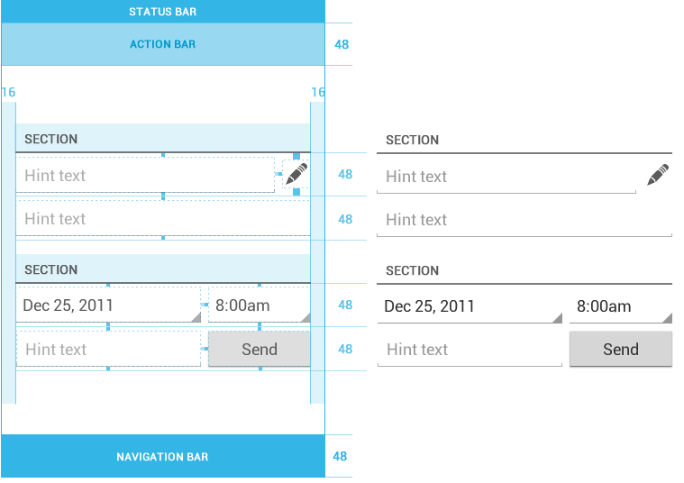
Touchable UI components are generally laid out along 48dp units.

If you design your elements to be at least 48dp high and wide you can guarantee that:

- The size buckets are handset (smaller than 600dp) and tablet (larger than or equal 600dp).
- The density buckets are LDPI, MDPI, HDPI, XHDPI, and XXHDPI.
Because it's important that you design and implement your layouts for multiple densities, the guidelines below and throught the documentation refer to layout dimensions with dp measurements instead of pixels.

Space considerations
Devices vary in the amount of density-independent pixels (dp) they can display.To see more, visit the Screen Sizes and Densities Device Dashboard.
48dp Rhythm
Touchable UI components are generally laid out along 48dp units.

Why 48dp?
On average, 48dp translate to a physical size of about 9mm (with some variability). This is comfortably in the range of recommended target sizes (7-10 mm) for touchscreen objects and users will be able to reliably and accurately target them with their fingers.If you design your elements to be at least 48dp high and wide you can guarantee that:
- your targets will never be smaller than the minimum recommended target size of 7mm regardless of what screen they are displayed on.
- you strike a good compromise between overall information density on the one hand, and targetability of UI elements on the other.

Mind the gaps
Spacing between each UI element is 8dp.Examples

TERIMA KASIH ATAS KUNJUNGAN SAUDARA
Judul: Style of Application
Ditulis oleh Unknown
Rating Blog 5 dari 5
Semoga artikel ini bermanfaat bagi saudara. Jika ingin mengutip, baik itu sebagian atau keseluruhan dari isi artikel ini harap menyertakan link dofollow ke http://androidapple7.blogspot.com/2013/10/style-of-application.html. Terima kasih sudah singgah membaca artikel ini.Ditulis oleh Unknown
Rating Blog 5 dari 5
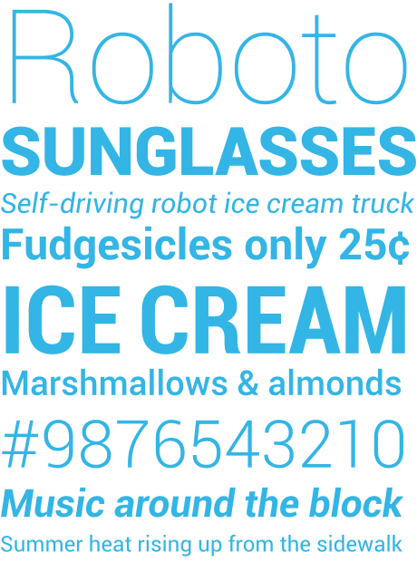
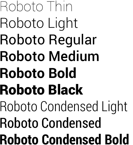
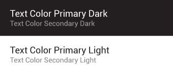
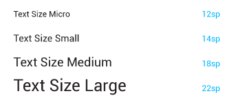 Users can select a system-wide scaling factor for text in the Settings app. In order to support these accessibility features, type should be specified in scale-independent pixels (sp) wherever possible. Layouts supporting scalable types should be tested against these settings.


0 komentar:
Posting Komentar